Today we're going to take a brief look at Australia's electrical infrastructure. The dataset is available publicly from Geoscience Australia, but for those who don't dabble in GIS software it can be a little hard to get to. I've put it all together in QGIS, and here's a few snapshots for the curious. Now you can pretend you're an expert electrical engineer and say judgemental things about Australia!
These maps cover major national powers stations, electricity transmission lines, and substations. If you've ever wondered where your electricity comes from, or how it gets to your house, this may give you a brief idea of how it all fits together.
Let's start with Australia as a whole. Translucent circles represent electrical power stations, and their size is weighted by the generation capacity. For convenience, any power station that has a generation capacity of greater than 250MW is labeled. Any non-renewable source is shaded black, and renewables are shaded in red. Transmission power lines are in red, and substations are the small red dots. Transmission lines are weighted based on their voltage capacity - thicker means more kV, thinner means less. Dotted transmission lines occur underground and the rest are overhead.
You can click any map for a high resolution version.

Detailed analysis aside, we can see that Australia is still largely based on non-renewables. This is unsurprising. Similarly unsurprising is the south-east coast concentration, and proximity to densely populated areas. Tasmania is mostly devoid of non-renewables, which is great, but what's that large red circle in the south east? Let's take a look in more detail.
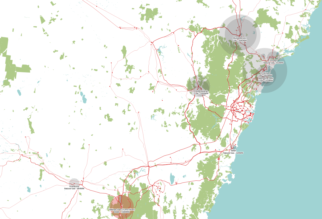
Zooming into NSW, we can capture Talbingo Dam, which services the Tumut hydroelectric power station. Tumut is special as it is the highest-capacity renewable power station, and according to the list of major power stations by the Department of Resources & Energy, it has a capacity of 2,465MW. Put into context, this is just under the 2800MW capacity of the Bayswater coal plant, the second largest non-renewable power plant in NSW.
All this talk about capacity is really important because most renewable power stations have a capacity of less than 100MW. So you would have to build say 20-40 renewable power stations to equal the capacity of a single coal plant. If you excluded Tumut and Murray (the next high capacity hydro after Tumut), and added up every single renewable power plant in NSW (wind, solar, hydro, geothermal, biofuel, and biogas), you would only then equal the capacity of your average NSW coal plant. Snowy Hydro, which runs the show, are damn successful, and the secret is in the name: snow makes for good hydro! All that melting and sudden runoff is great for electricity.
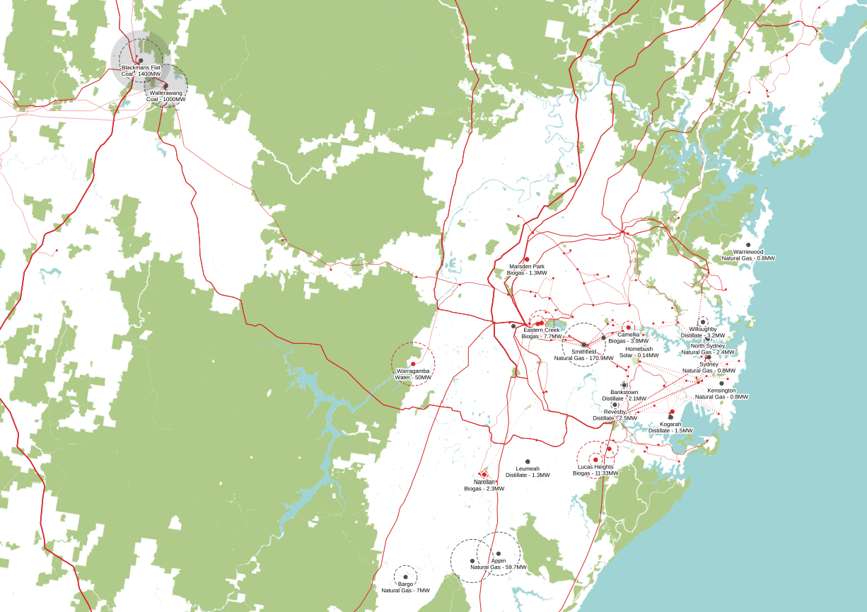
Zooming further into the Sydney region shows coal around the perimeter, as well as the local contender which is the Warragamba dam hydro. Despite the promise of the Warragamba dam hydro, it is important to note that it is disconnected from the grid and only provides power when the dam is at a certain level. This is quite a rare occasion for Warragamba, which provides 80% of the potable water of Sydney. On my recent visit to Warragamba, I was actually told that the hydro is being shut down due to high operating costs. Simply put, the dam is better as a reservoir instead of a hydro source.
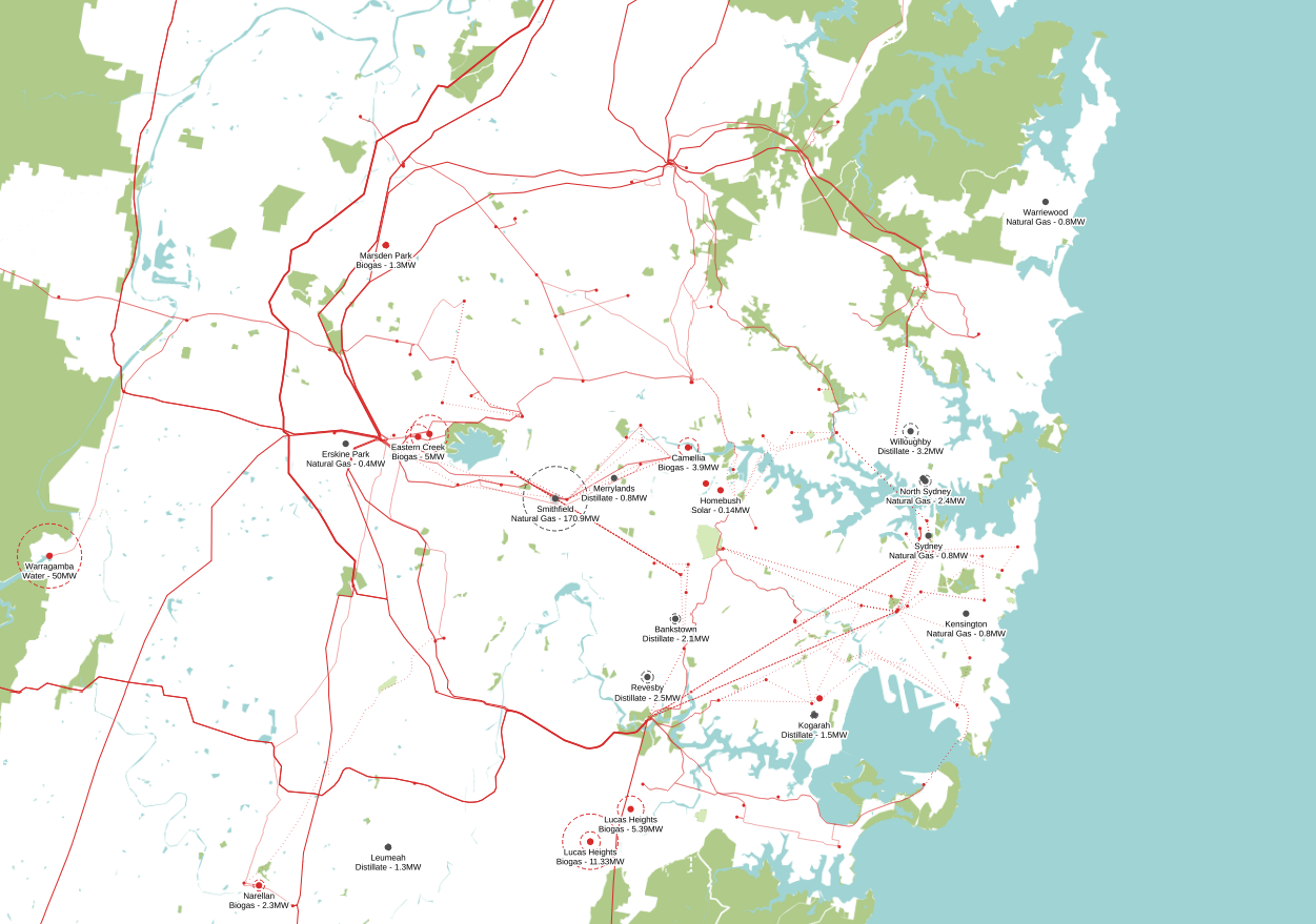
Let's take a closer look at the Sydney region. We see a spatter of renewables and non-renewables. Still, the non-renewables outweigh the renewables - we'll take a closer look at insolation and local solar capacity in a future blog post, but right now the only renewables of note are the biogases. In short, these stem off landfills (Eastern Creek, Lucas Heights, and Spring Farm) and industrial wastelands (Camellia). Also interesting to note is that just like the Warragamba dam, all of these landfills are already shut down or close to shutting down. We'll talk about the waste issue and landfill capacities in a future blog post too.
In summary, Australia has a little bit more work to do. Of course, the issue is a lot deeper than these maps, but we can't cram everything into one blog post, so hopefully it's enough to whet your appetite.